 Who is Alice?
And, because one gets fascinated by the oddest things, here are more pretty pictures to look at. There are plenty here by various artists over a stretch of time, and the list is certainly not inexhaustible:
 Fig 1: John Tenniel's Alice. Tenniel is the original illustrator of the Alice books.
In class yesterday, we talked about visual archives, and how technology has helped to build this visual memory bank of images that become part of how we look at history and culture too. It's interesting that the artists below incorporate easily recognizable aspects of alice into their drawings, such that we know what they are referencing even if they are out of context.
A note before wonderland kicks in: The sources of the images are linked via the labelling for the pictures.
A note before wonderland kicks in: The sources of the images are linked via the labelling for the pictures.
Arthur Rackham:

Fig 2: A series of Alices. Don't know if it's me over-reading, but two of the scenes are inverted horizontally (like through a mirror). The first Alice with all the cards faces left in Tenniel's version, while the mock-turtle and griffin in the 3rd picture faces right.

Fig 3: Her Alice is pretty darn unique too. Not blonde?
Ralph Steadman: The druggie version. And he wouldn't be half wrong too as somewhere along the way, Alice becomes symbolic of the phantasmogorical and amoral, though he keeps the satirical legacy from Tenniel:
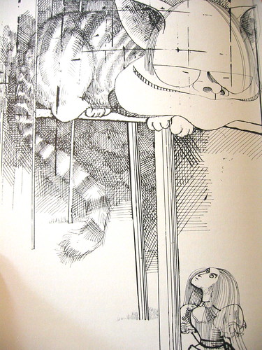

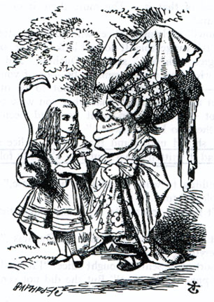
 Fig 6: Tenniel's original illustration. Also compare Rackham's above.


Fig 5a, b: The red or blue debate goes beyond existentialism...
Then there is Tim Burton, master of the macabre and wacky:
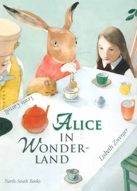
Lisbeth Zwerger: And except for the Wizard's coat in NYEDC'S OZ (which was modelled after The Matrix's Morpheus), Zwerger also provided some nice background ideas for an alternative Oz, though due to money constraints and the way the script was headed, idea got abandoned.
Fig 3: Her Alice is pretty darn unique too. Not blonde?
Ralph Steadman: The druggie version. And he wouldn't be half wrong too as somewhere along the way, Alice becomes symbolic of the phantasmogorical and amoral, though he keeps the satirical legacy from Tenniel:
It's not all blue pinafores...
Yup. Even though the Alices all bear some resemblance to the original, artists have focused on more than just her dressing, which is one of the first few things artists are determined not to copy directly. Rackham, who is a famous children's books illustrator from the 19th, early 20th century has his Alice in a pink flowery dress, as if in opposition of the traditional Alice in blue. On the other hand, the striped stockings, crown, pinafore, bushy hair , cards, chess set, Victorian-esque setting and associate white rabbit are often retained in some form to remind the viewer that this alludes to the books.
Yup. Even though the Alices all bear some resemblance to the original, artists have focused on more than just her dressing, which is one of the first few things artists are determined not to copy directly. Rackham, who is a famous children's books illustrator from the 19th, early 20th century has his Alice in a pink flowery dress, as if in opposition of the traditional Alice in blue. On the other hand, the striped stockings, crown, pinafore, bushy hair , cards, chess set, Victorian-esque setting and associate white rabbit are often retained in some form to remind the viewer that this alludes to the books.
In fact, moving away from Tenniel's political caricature roots, the Alice of today is definitely more of an icon of fantasy, gothic and Victorian periodization which subsequently fits nicely into consumer culture quite nicely - be it for gaming and video culture, manga, food, or films.
 Fig Fig 6: Tenniel's original illustration. Also compare Rackham's above.
Some artists, and in particular those from pop culture, appropriates the Alice figure for themselves. For example, the topsy-turvy game-like rules of Wonderland and questing style of the Alice text adapts itself nicely into gothicky pop art well.
Fig 5a, b: The red or blue debate goes beyond existentialism...
Then there is Tim Burton, master of the macabre and wacky:
 Fig 6: Mia Wasikowska as Alice. Very Victorian. Very pop culture. Very blue.
 The stockings. As I said....

Fig 7: Vintage Classics edition of the book
Then there is the pinafore, which gives some people odd ideas.
Then there is the pinafore, which gives some people odd ideas.
 Fig 8: The Internet is for porn. And for everything else.
And just for the heck of it...
 Why indeed.
F.g 9: Stuio I.G. and CLAMP.
What kinds of cultural cache is there in the Alice? I wouldn't know. But it does make for a convenient signfier for the weird and precarious nature of society...
 Fig
Fig 
 The above two images are from Hiten, his first exhibition, which exhibits a very wide array of what Amano is capable of. His latest works in progress in fact indicate him going back to his animation roots (Speedracer ugh). As it is, I seem to have a penchant for the German Expressionist-ish style... But then again, some of the best illustrators do seem to come from Germany too...
 Image sources
